Hi guys! It’s been a minute. I thought I would share my thoughts On how to get out of a creative rut/funk. It happens to all of us artists at some point, even a couple of times a year.
Here are 5 ways to get out of that creative funk

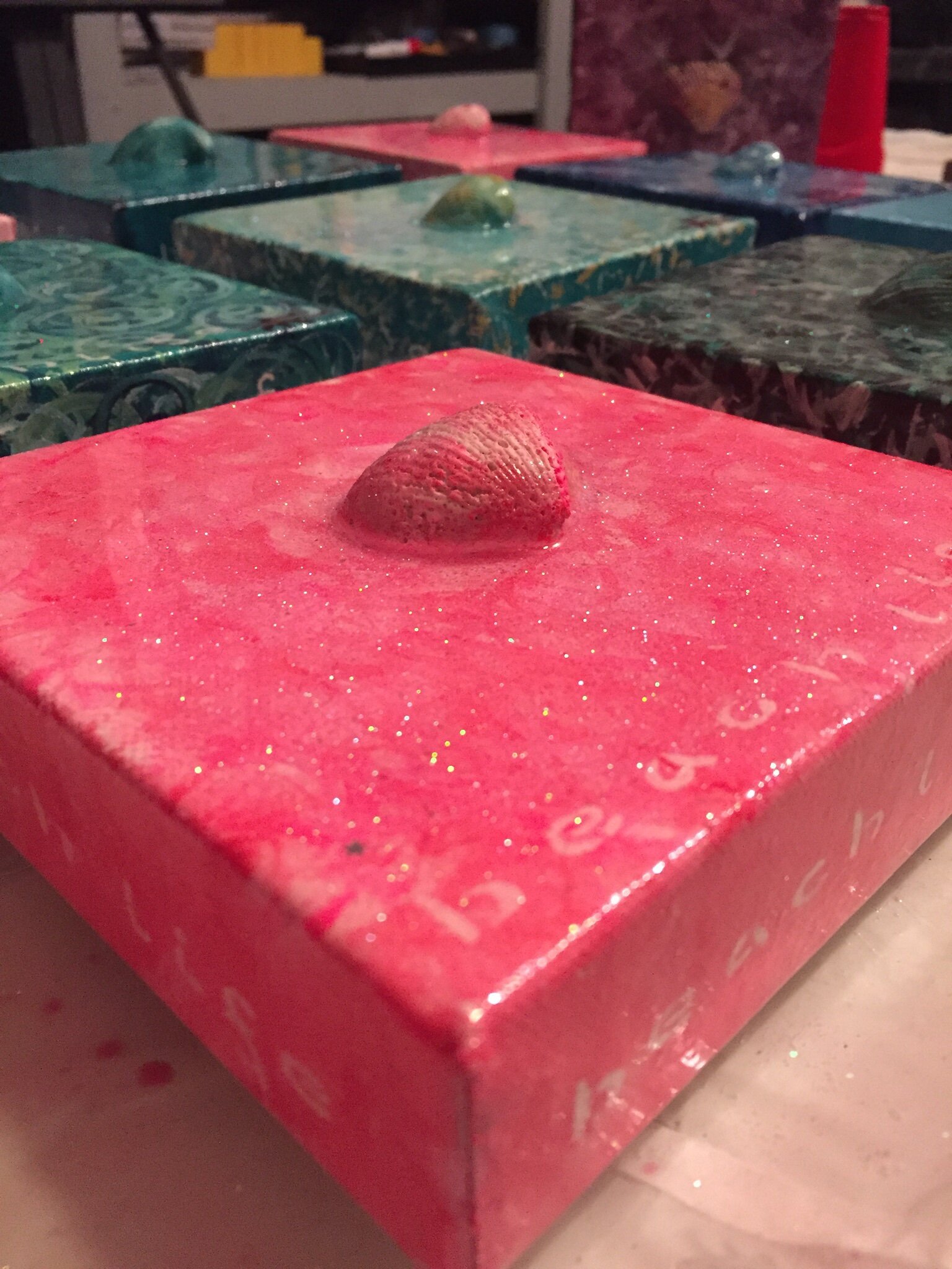
Organize your art space/studio
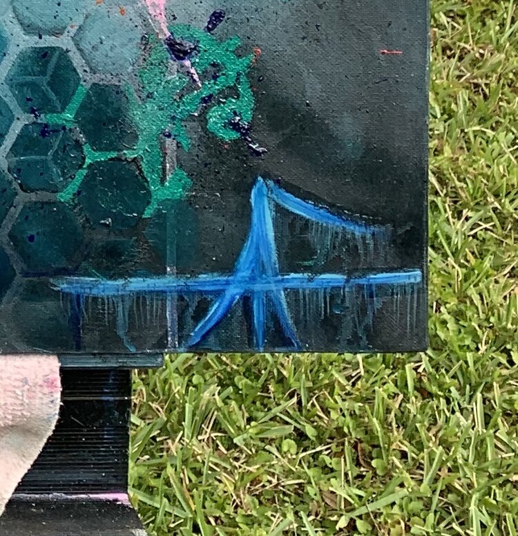
It helps me get the creative energy flowing when I go through my art supplies. I inventory my paint colors, canvases and other supplies. Often, this helps reinvigorate my creative energy and motivates me to start new projects.
PRACTICE PRACTICE PRACTICE.
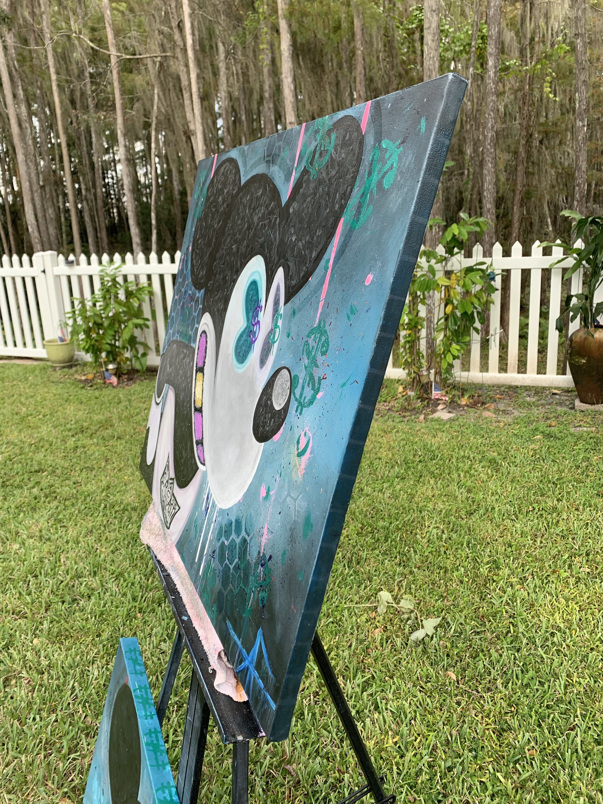
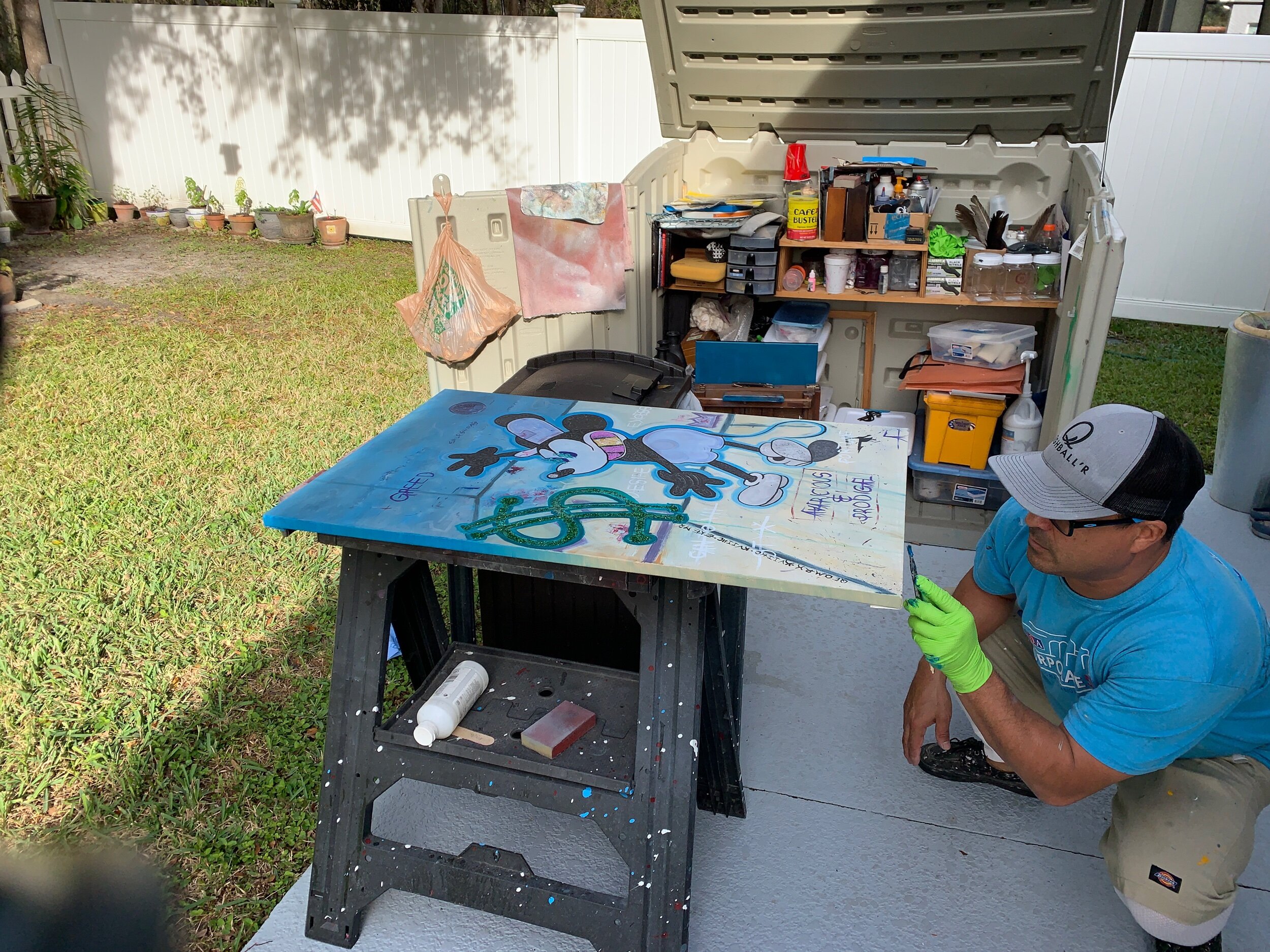
Practice makes perfect right? Well, ya’ll know that I am not a fan of perfection. However, practicing palm trees, seascapes, clouds, etc., helps me get in a creative state of mind.This is as easy as grabbing an old canvas, and painting your subject, over and over again. I feel this technique forces your mind to get out of the analytical left side, and into that creative right side of your brain. 🧠
Go look at some art in your community.
This is as simple as visiting a museum, or going to your local arts district.TOUCH UP AN OLDER ART PIECE
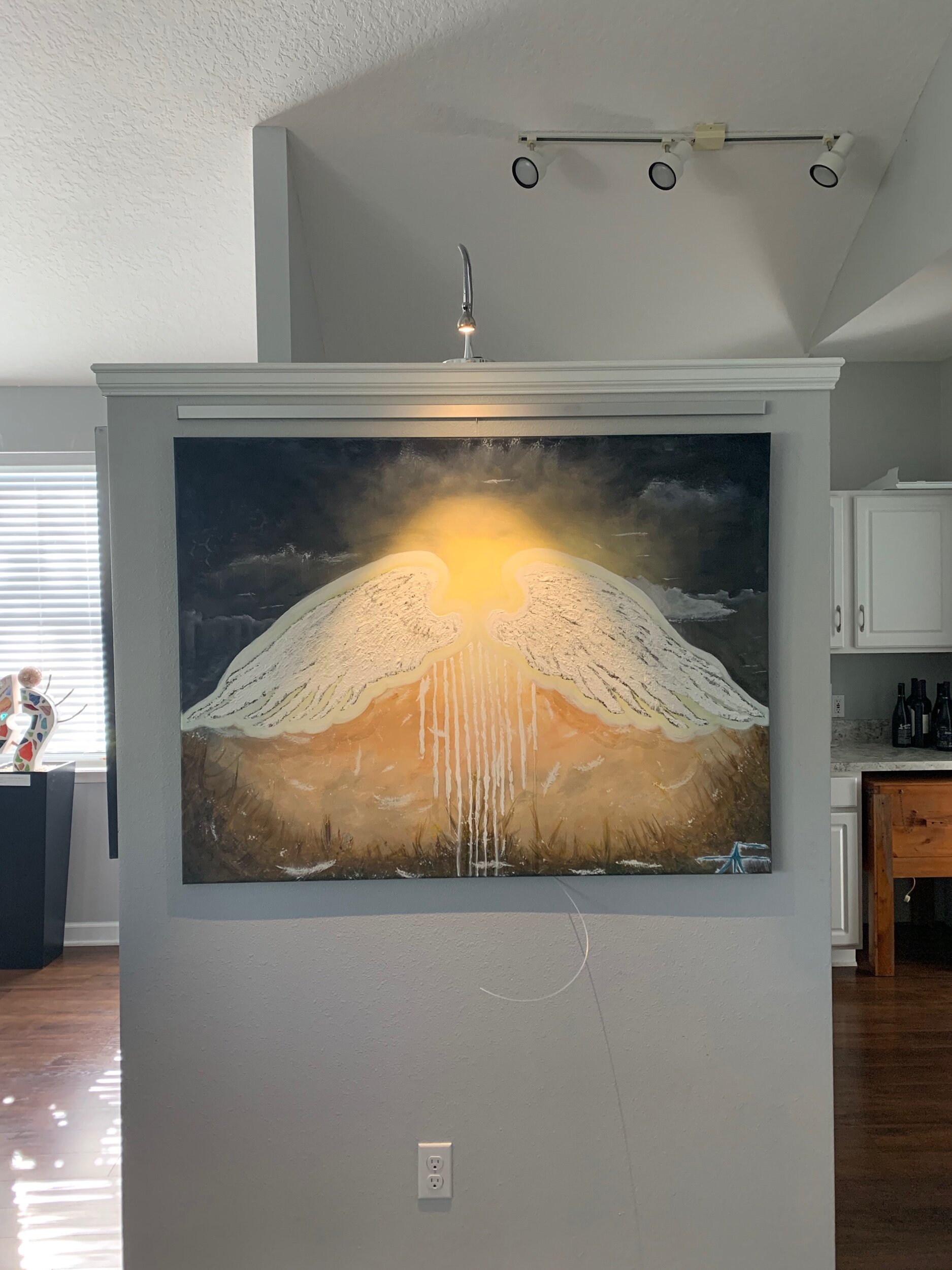
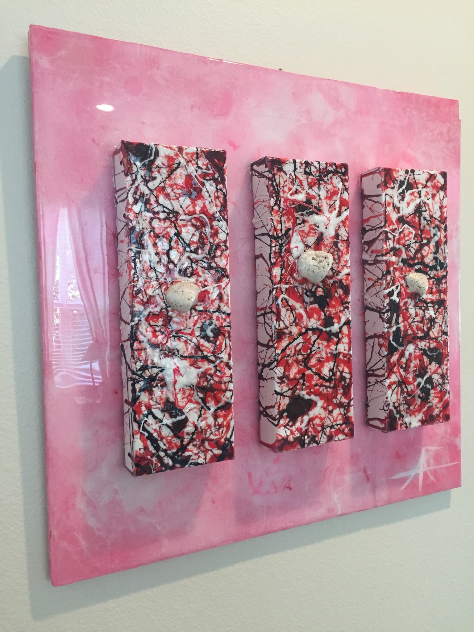
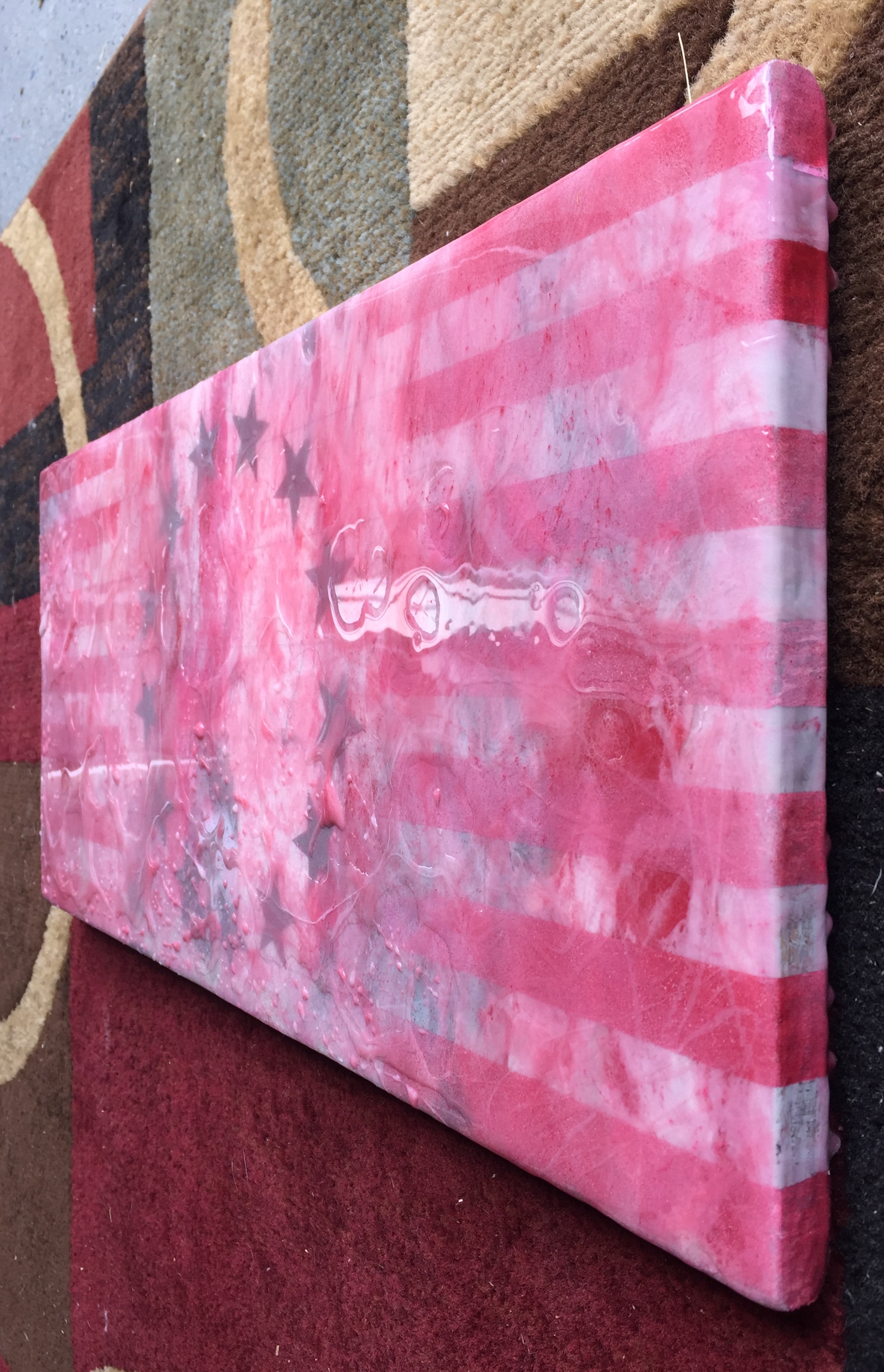
Sometimes looking backwards helps you move forwards. Referencing/touching up your older art pieces may help propel you in a new direction, or simply jump start you into a new piece. This can be as simple as cleaning up some borders on an old painting. Also, I find varnishing some pieces gets me excited and fired up to create my next painting.
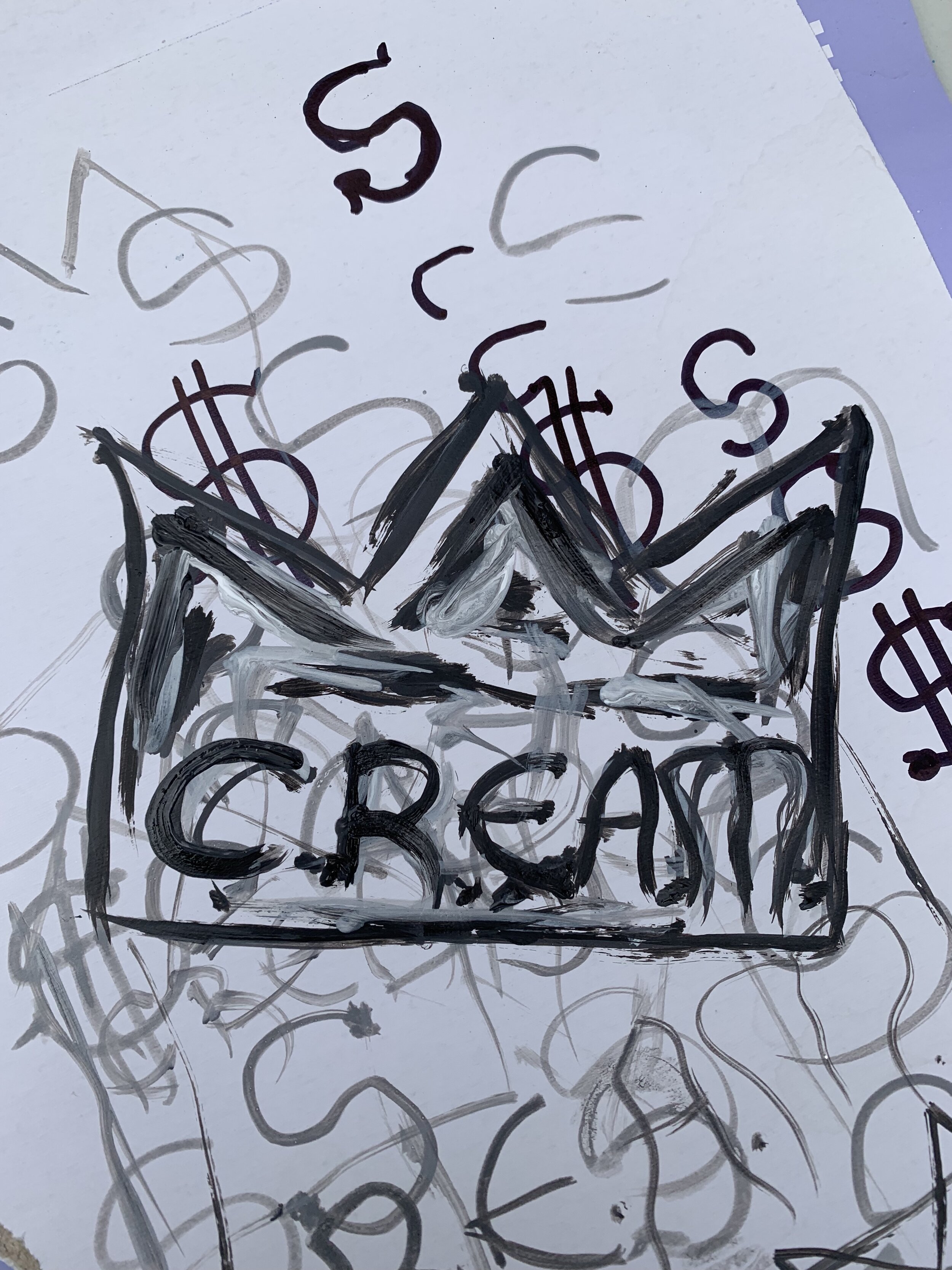
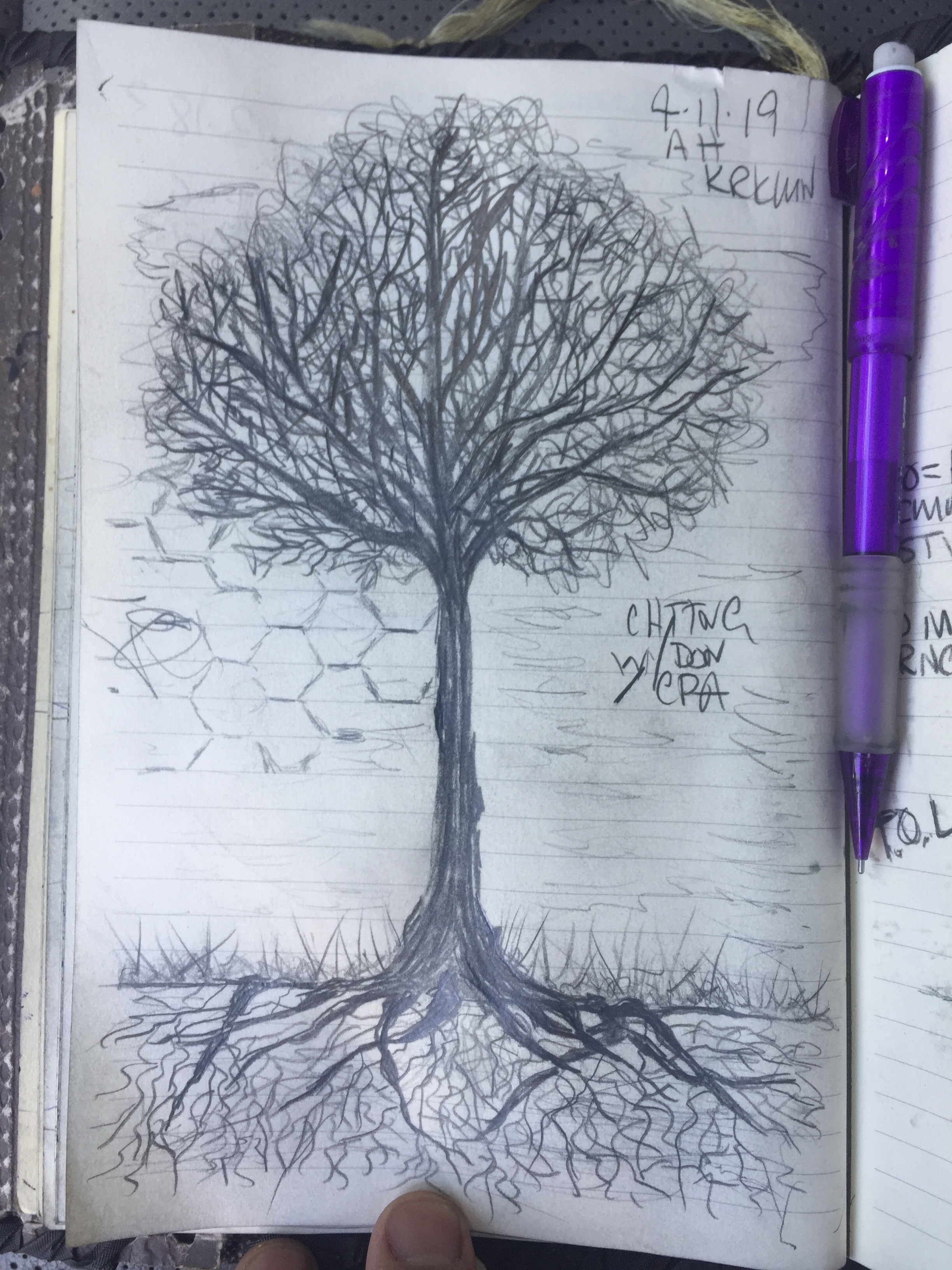
SKETCHING
I find sketching ideas that you may be interested in painting, is a fantastic way to get inspired & motivated to create your next masterpiece.
BONUS TIP:
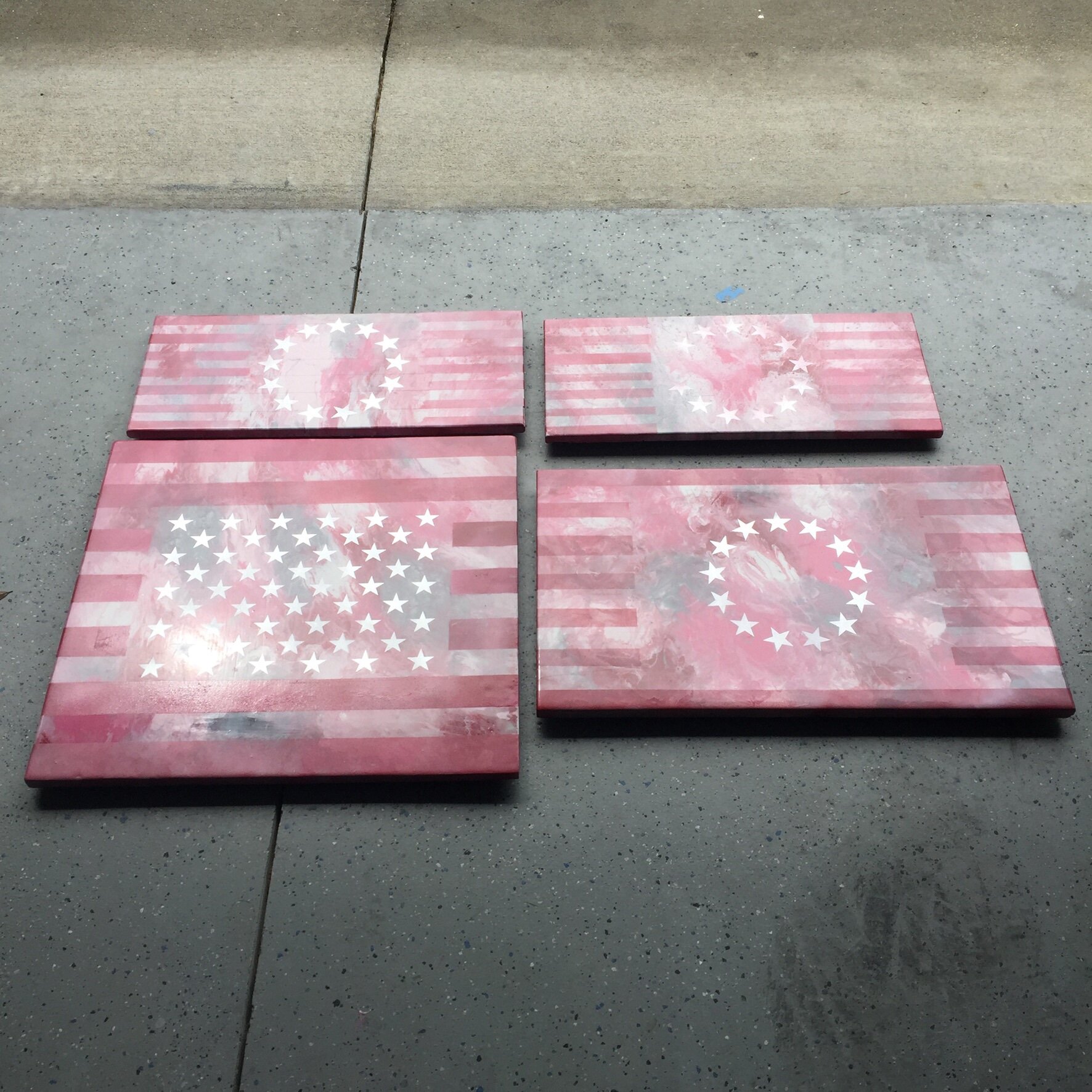
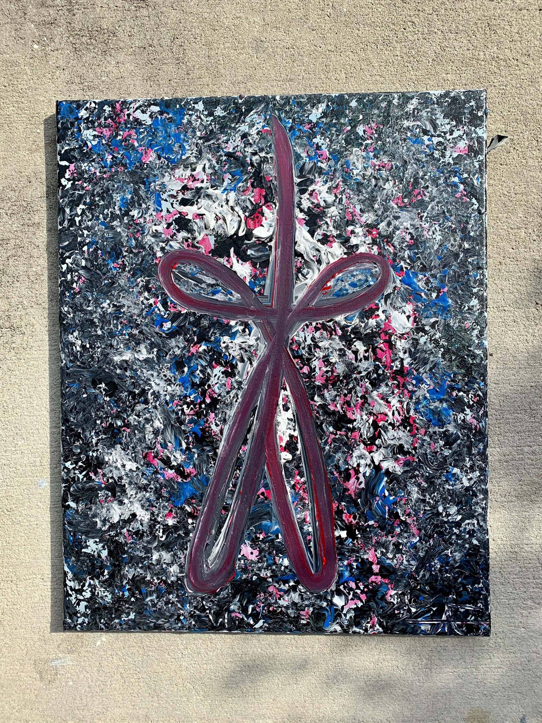
KEEP A SIMPLE PALETTE. Challenge yourself to create a painting using a limited palette. Maybe just black and white?
There are more ways than these that I mentioned. Will you share your ways on getting out of a creative funk with me?
I sure hope this blog helps get you inspired and motivated to create your next masterpiece. I know that it has sure helped me out.
Leave your comments down below
Until next time my friends, you know what to do:
“Stay creative, and keep on painting!”
- C.A.M. OUT