LITTLE BIG ECON STATE FORREST (ORLANDO, FL)

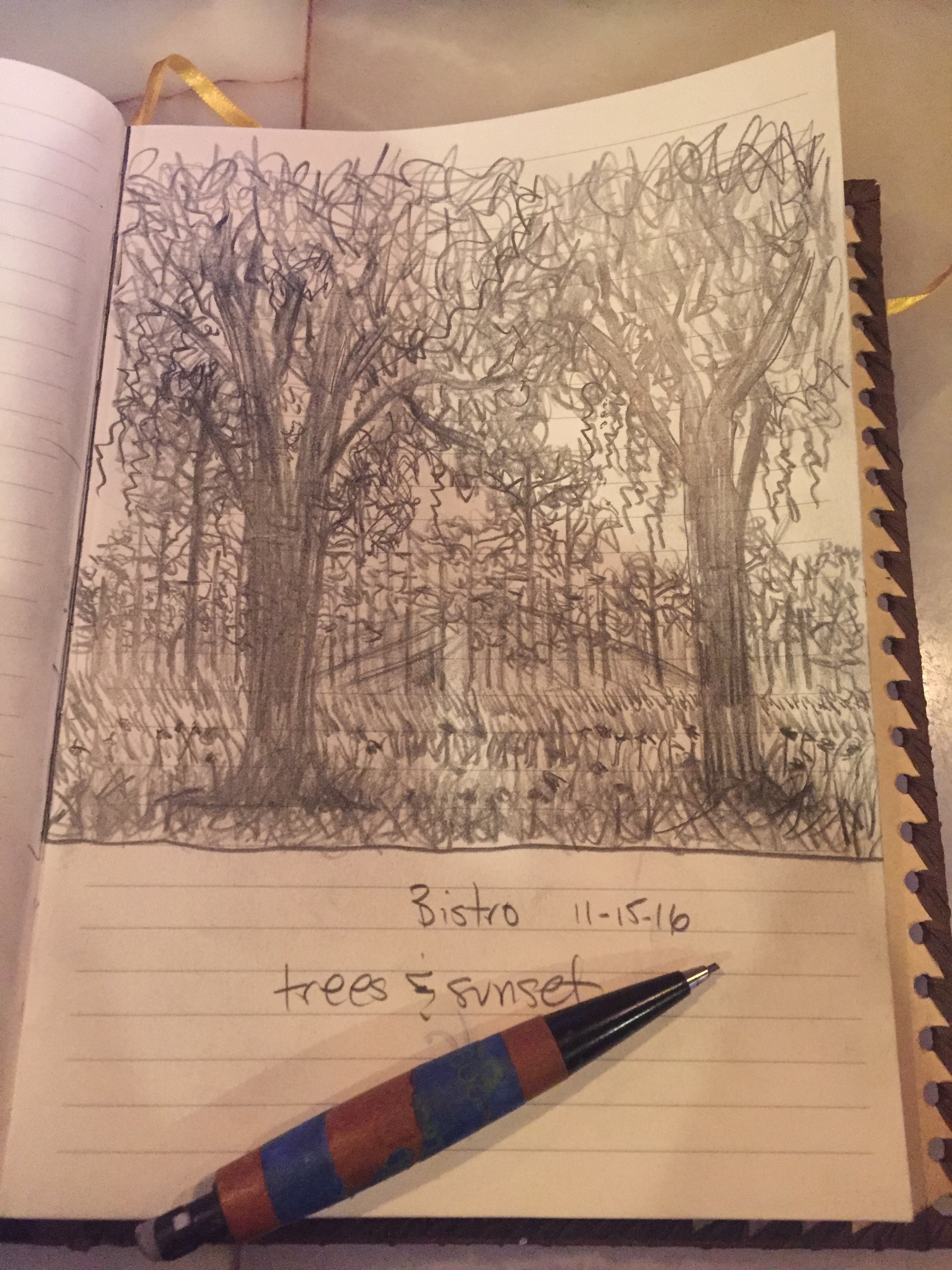
One of my favorite places in Orlando is the Little Big Econ (Econlockhatchee River) State Forest in Geneva, Florida (EAST ORLANDO)

I mountain bike and trail hike there often.  Recently, I stopped to enjoy the view and noticed a how great it was from the trails. The palms & trees really jumped out at me from this vantage point.

LITTLE BIG ECON RIVER TRAIL

I've ridden through this part of the forest countless times.  I guess this time, I just saw something different.  I decided I wanted to paint this scene.

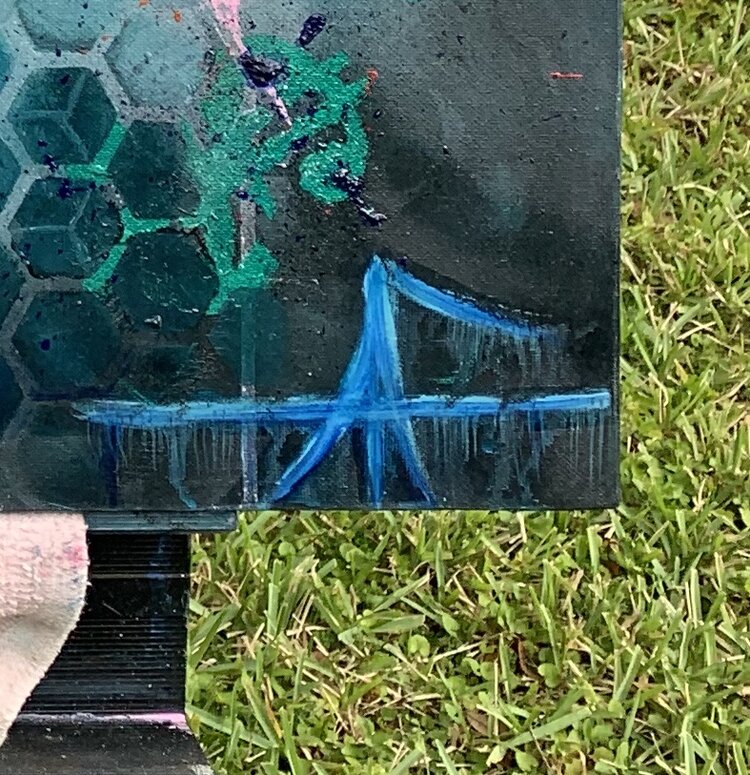
So, sticking with my current phase of "minimalist palette", I started with a black and white theme.  I decided to add color, but in limited amounts... I used color mostly for the sky, and used different hues of yellows, browns, greys for the "bluffs" and water reflections.  I wanted to keep my version dark and moody... As if it was right around sunrise.

ECON RIVER TRAIL BLUFFS

Isn't it amazing how the painting changes in different lighting?

The bluffs (dirt walls) were done with the paint knife.  The knife puts out some great texture and gives the painting an awesome 3-D effect.  I just love the way the colors all blend together and the paint breaks off where it wants to.  It's truly organic.  You just have to trust the knife and let go.  I was very satisfied with the reflections.  It was tricky keeping the canvas wet.  I started this painting off with a dry canvas.  I added a slow medium as I went along, for blending purposes and the reflections.

Colors I used were: black, white, alizarin crimson, yellow, yellow ochre, hooker green, and pthalo (thalo) blue.

HAPPY PAINTING YA'LL!

FRAMING MY OWN ARTWORK

It's an incredibly beautiful day here in Otown (Orlando).  I got up early today to make some more frames for some of my pieces. I'm now using Birch wood. Originally, I started making frames with pre cut pine strips.  The cost per foot was outrageous.  Making the switch to Birch was a no brainer.  It's much lighter and the grain pattern is stunning.  It really pops out when you add the stain.

I recently went to Home depot and bought a whole sheet of Birch plywood.  I cut my own strips for the frames using my table saw.  It's way more cost effective and with the leftover wood, I cut some custom frames for future "wood" paintings. 

LOT OF FRAMED PIECES

These paintings in the pic above are all framed and ready to be hung.  

Framing your own artwork is a strong selling point, especially since most people don't want to deal with having to frame a painting themselves.

Once I got my framing formula down, the task got much easier.  It's like anything else: Practice makes perfect.  I can make two frames in about 2 hours.  Cut, squared, glued, nailed, and ready for staining.  Not too shabby.  

I highly suggest buying "pre stain wood conditioner" by Minwax.  It penetrates the grain nicely and prevents blotching.  Also, it will save you having to apply multiple coats of stain.  Two should be plenty.  Remember to sand prior, and in between stains.

Here's a few more pics of my framed and soon to be framed artwork.

The Journey Home and Moody Lake

SLITHERING MOONRISE AND HAVASU WATERFALL

With these last two pieces framed, I'll be ready for the Wine and Art Walk in New Smyrna Beach next weekend march 25th.  

HAPPY PAINTING AND KEEP[ CREATING YA'LL

C.A.M

TOUCH OF BLUE 1 & 2

I hope everyone enjoyed their Superbowl Sunday.  That Patriots comeback and Falcons meltdown was definitely one for the ages.

My plan Sunday was to go to the Mt. Dora Arts Festival. I got up early on Sunday and got involved in this painting.  The original idea came from a real picture posted on Instagram.  It caught my attention because it was a black and white.  I decided to make my painted version of it with touches of blue values.

I kept my palette to a minimum using only black, white, pthalo blue, and a touch of pthalo green. The canvas was an 8 x 10. My idea was to start with a smaller painting, then take the idea and work it onto a bigger canvas.  

TOUCH OF BLUE 1

The latter version I wanted to make more subdued, with a dreamy like feel and mood. I did expand the palette a bit, adding purplish hues.  I mixed pthalo blue and  alizarin crimson for the purple values.

TOUCH OF BLUE 2

The result was what I was going for.  I had some really cool jazz music playing and it got me into this "free" broken stroke zone.  That's when I added the flecks for an atmospheric feel.

I still want to do another version going for a full hypnotic theme.  I'll shoot for that later this week.

By the way, I never did make it to Mount Dora... Oh well.

Have a great week.

Uncle Alfresco

PALM TREES ARE IN THE MIX THIS WEEK

LATE POST FROM JANUARY:

So unfortunately my Mother had an accident at home this week. She broke the femur in one leg & the tibia in the other. Thankfully, surgery went well & she is now in rehab.  To my social media friends, thanks for your thoughts, prayers, and healing vibes.

I made a painting for her, so she can keep it in her rehab room. It was a landscape theme with lush palm trees and water reflecting from a pond. 

Her healing painting inspired me to paint another similar painting that I can share with you. 

I kept the palette limited, once again, keeping with my current trend of a minimal color selection. Mostly black & white with shades of green, and some browns. I'm really enjoying this style of limiting one's color selection. I can't emphasize enough how it's teaching me discipline in painting, as well as another form of a painting technique.

FullSizeRender.jpg

Happy painting everyone.

C.A.M. 

Your Uncle Alfresco

ANOTHER BLACK & WHITE PIECE, FAREWELL 2016

Greetings & Salutations from the Complicated Art Man. 

So I've been perusing the social media feeds last couple of days & most people are ready to part ways with 2016. The proverbial, "bye bye 2016, had enough of you", or "F YOU, 2016, I'm done with you. Bring on 2017."

I myself have to say that  2016 was a fantastic year. It started off with a breakup, and a concussion from a mountain biking accident at Snowhill Trail in Oviedo, so I guess it was all uphill from their.

I went into a creative frenzy all the way up till June, then took the Summer off from painting.

I tried to get get back into the groove in October, but it was a slow return. I finally found myself back in my creative zone in early November. It's been superb!  

I have been experimenting with black & white values lately & I have to say that I'm loving the limited palette style. Kind of minimalistic.  

I find myself tempted to add color to this creative process, but I have to resist the temptation & wait for the end result. It is quite rewarding. I've mentioned it before and I still compare this type of painting to an "exercise" in discipline. I highly recommend the limited palette technique. Try it sometime. It's also a good way to ease yourself back into painting, if you haven't painted in awhile. 

So, with that said, "Bring on 2017, cuz I'm ready for you!! 

Good luck ya'll & happy painting. 

Happy New Year from your Uncle Alfresco, A.K.A The Complicated Art Man. 


ENTER THE WATERFALL PHASE

Hi ya'll.  Hope the Holiday season has been kind to you.

Back in May I was in Vegas and took some photos with some friends at the Flamingo. The Flamingo waterfall in the wildlife habitat was the first one I ever painted. 

FLAMINGO WILDLIFE HABITAT WATERFALL

Recently, it seems that I have entered my waterfall phase.  Here's a couple of them.

BLACK AND WHITE LANDSCAPE WATERFALL, WITH HINTS OF COLOR.

BLACK AND WHITE LANDSCAPE WATERFALL, WITH HINTS OF COLOR.

FULL MOON RISING AND WATERFALL

FULL MOON RISING AND WATERFALL

I'm really into this phase at the moment...  This was my first painting with a moon in it... That I can remember. This painting also gave me an idea for a "full moon" painting.  Onto the next...

I used the paint knife for the trees as well as the rock/stone wall.  I really enjoy using the paint knife. It really is incredible what you can do with it. So long everyone.

Merry Christmas from your Uncle Alfresco!

DECEMBER PROJECTS, ART EXERCISES & EXPERIMENTS, & NEW PIECES

Happy Holidays.  Hope everyone out there is having a great Winter.  I'm slowly getting back into my painting groove.  I started by making a couple of frames for some pieces to wet my whistle.

Then, I did some random sketching while out at bars/coffee shops.  I find that sketching gets my desire to paint going again.

Third and most importantly, I did some painting exercises to get my mechanics and techniques back. In my opinion, painting exercises provide a way to "paint" without any expectations. It's great to splatter some paint on a canvas and just let the brushes go nuts.  When you don't set out to paint your greatest masterpiece, how can you go wrong?  

It really is amazing what a frame does to your artwork.  I bought some 1 1/4" pine trim at Home Depot and stained it with different stain combos.  The one on the right has a purple dye, tint job.  It's actually a concentrated "bordeaux" tint, and the company is called TransTint.  They are out of Cleveland, Ohio. They have many colors of tints.  It's not cheap though.  The upside is you will have some awesome and uniquely colored frames, that practically no one for hundreds of miles will have.

It's a really cool dye to work with, you just add a few drops of water and you are good to go.  

Purple Flower Abstract in custom strained frame.

Tres Palmas Y Tormenta (Hollywood Beach, Florida) in custom strained frame.

An experiment in Black, White, and Red.  This next piece started off as a painting exercise, using a limited palette. When it started to turn into a painting, I listened to that inner voice and kept going.  That's the same voice we have to learn to listen to when it says STOP, or TAKE A BREAK...GO CHANGE YOUR WATER BUCKET & STEP AWAY...

I did paint this piece on a practice canvas.  If you look closely, you can see some green on the right side edge, in the middle.

I used the knife technique for the water lines/edges as well as the rocks.  I really enjoy using the knife.  It gives the painting a 3d layer of texture that almost brings it to "life".  I find that practicing with a limited palette is a great way to put you into a super creative state.  It kind of forces you to find as many different values as you can with the limited color palette.  It's kind of a discipline exercise as well.  You will find yourself wanting to use more colors...Don't do it... stick with the exercise.

An experiment/exercise with different values of ONLY RED, BLACK & WHITE.

My intention with this next sunset piece was to learn how to manipulate acrylic paints to appear more like oil paints.  I used a retarder medium from Liquitex, as well as Bob Ross's Liquid Clear to slow down the drying time.  The Liquid Clear was my missing ingredient.  Liquid Clear slows the drying time significantly and allows for maximum blending opportunities.

***The LQ will have an adverse effect on the acrylic. It will "crack" the acrylic and give your painting a "frescoed" look, very aged look. I didn't expect this, so I had mixed emotions about it at first. I used it to my advantage & went with it. ***

Once you work with it a few times you can start to see how the acrylic paints start to behave more like oil. You only have to use thin coat of the Clear to prime the canvas. The key word is "thin" coat of the Clear.  A little Liquid Clear goes a long way.  All joking aside, it never hurts to peep some of the Bob Ross videos on You Tube.

SIDENOTE: Your painting will take A LOT longer to dry than normal.  I suggest the hair dryer technique or just be patient.  Give it at least 48 hours.  You can always hold your masterpiece at an angle to look for glistening areas that would indicate it is still wet.  I waited five days before I added a coat of clear gloss medium to "finish" this piece.

This next painting is an experiment with a very limited palette.  Black & White ONLY, on a black canvas. The idea is to let this "BASE" painting completely dry, and then come back over it with colors.  It is probably a good idea to let it dry for at least 24 hours.  Then come back over the entire painting with a thin coat of the Liquid Clear, and start adding the colors you want to use. I will give it 48 hours to dry, due to the fact that I used the paint knife technique on most of the trees. There is alot of texture on the trees.  

I am conflicted as to whether or not to add the color scheme.  I may leave the piece as is, and make another piece similar to this one. Adding the colors to the latter piece.  TO BE CONTINUED.

DEEP FORREST AND RIVER. DIFFERENT VALUES AND FLAVORS OF ONLY BLACK AND WHITE.

GOOD LUCK from your Uncle ALFRESCO!!

IT's BEEN A WHILE

So I took the Summer off from painting...Here is a sketch I did today. A tree in Winter Park Florida drew my inspiration... To Be Continued...

IMG_2432.JPG