Sketching: why it’s important

SK1

SK1

SK1

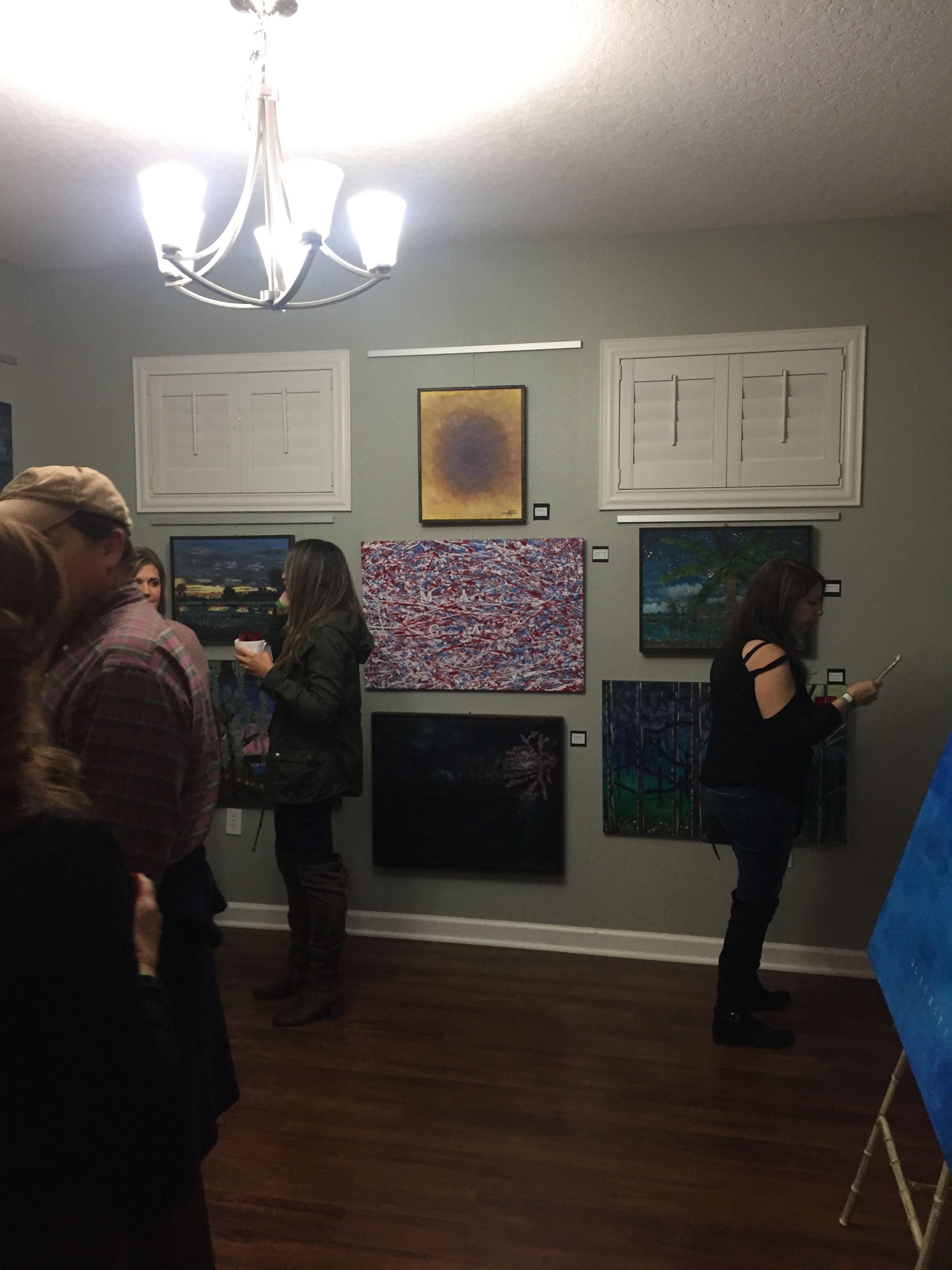
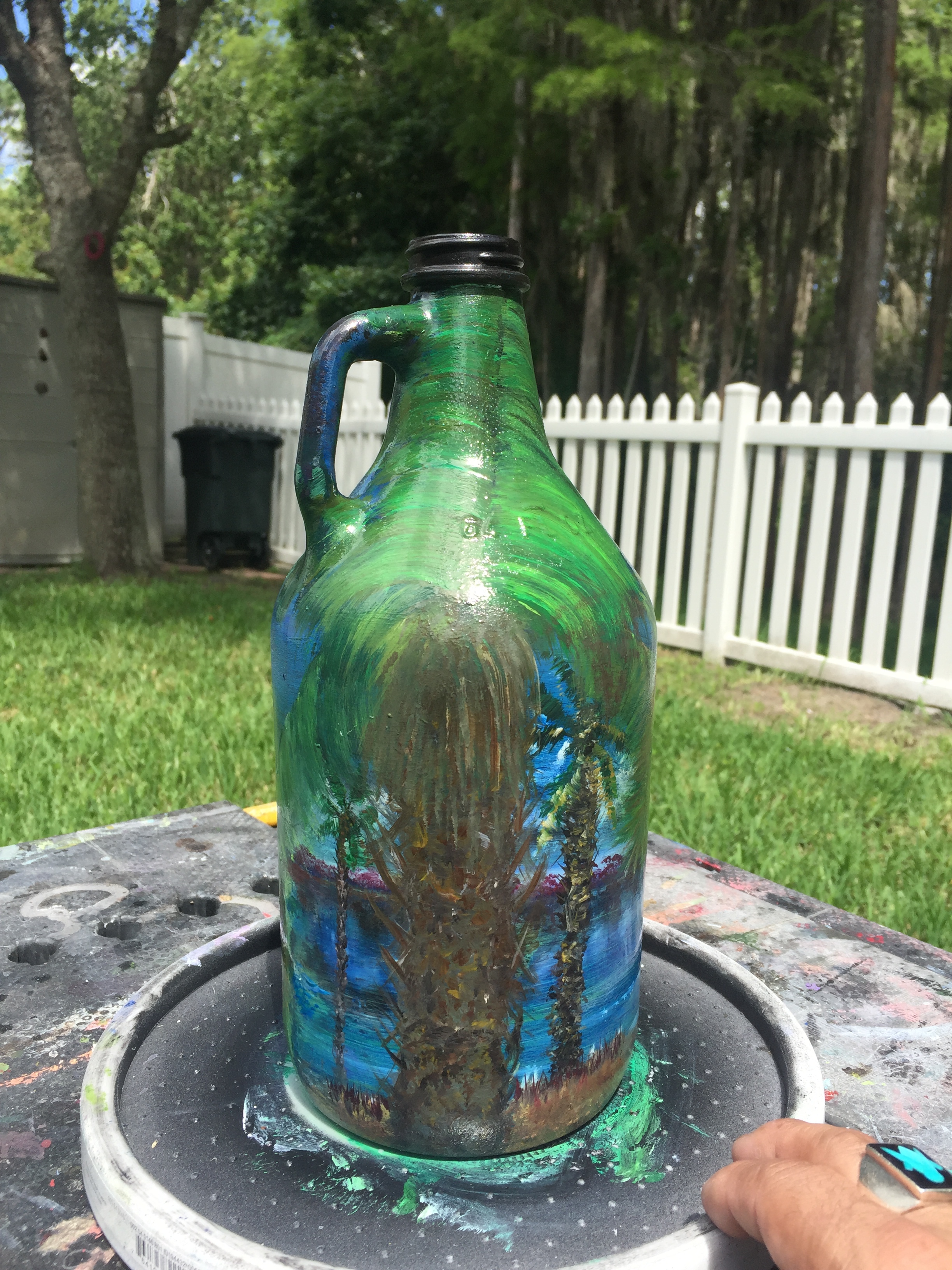
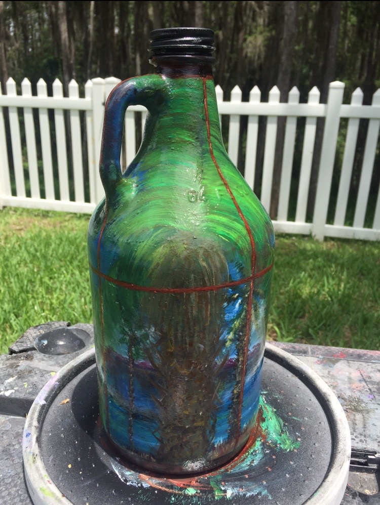
So just why is sketching important? In my experience, I’ve found that sketching is a great exercise to get your mind in a creative state. Sketching also gets me hyped up & motivated to start painting my project ideas.

I’ve also found out that sketching is a fantastic way to work out potential obstacles that may be lurking ahead in your project. These obstacles may potentially spoil your future art endeavors. I guess u can say it’s like a pre gaming for your big project.

In my experience, I’ve figured out that sketching has been very beneficial to me helping me become a more efficient artist.

Another benefit of sketching is that it can help you gain a different perspective from the initial “masterpiece of an idea”, that you had in mind. Recently, I found out that sharing your sketch ideas with someone may be a huge benefit to your project. Their perception of your concept may give you a different perspective or other options in which direction to take your project.

Sketching can also be a way for your ideas to naturally evolve into a painting. It can help make the transition from paper to canvas a smooth one. Possibly pre organizing your ideas from super complex and too many, to a less is more type of methodology.

in conclusion, sketching & doodling are your friends.

For me, it’s a way to “wake up” my brain’s creative juices and get my projects going. Working out those potential pitfalls through the sketching process has saved me time, and will save you time and headaches as well in your future projects.

SK2

SK2

HAPPY HOLIDAYS my friends,

Until next time, you know what to do:

STAY CREATIVE AND KEEP ON PAINTING.

C.A.M.

AVALON ART WALK

Greetings art enthusiasts. It’s that time of year for the Avalon Wine Walk. I’m proud to announce that I will be one of the featured artists during this event. Many of my pieces will be on exhibit at the Avalon Realty Group stop.

The Avalon Wine Walk event is organized by the Rotary club and many businesses in Avalon Park will be participating. This event is from 6pm-9pm. 

I still have a few loose ends to take care of before the show, but man has it been a learning experience. It has been great to get reacquainted with some of my earlier pieces & install hanging hardware on some that didn’t have any. I spent quite a few hours alone just getting some of the artwork “ready to be hung”, lol. Making frames and installing the hanging hardware is just another skill that I’m Getting better at, the more practice I get in. It is also another way to invest time in your craft that doesn’t involve painting. It’s a great alternative in case you aren’t in a “painting state of mind”. . . I’ve also learned that art that is “ready to be hung” is a great selling point.

Here are a few pics and a sneak peek of my gallery setup.  

Serenity on the St John’s #3 (Serenity Series)

Serenity on the St John’s #3 (Serenity Series)

IMG_5560.JPG
IMG_5559.JPG
Avalon Wine Walk 2018

Avalon Wine Walk 2018

It has been quite the learning experience setting up for this event. I put in at least 15 hours in setup time from first artwork hung, to rearranging all the pieces,  to making the exhibit labels. Of course, I had to add a few extra additions last minute lol.

LITTLE RED DOTS (monochromatic dreams series) 4 x 5

LITTLE RED DOTS (monochromatic dreams series) 4 x 5

Exhibit labeled artwork for Avalon Park Wine Walk @ Avalon Realty Group

Exhibit labeled artwork for Avalon Park Wine Walk @ Avalon Realty Group

Slithering Moonrise

Slithering Moonrise

All in all, I was very happy with the display of my artwork & I’m thrilled that it will be on display at Avalon Realty Group in East Orlando through January 2019.  

Dalí’s View/The enigma

Dalí’s View/The enigma

Hope you can stop by to check it out before it comes down:)  

C.A.M. Works on Exhibit

C.A.M. Works on Exhibit

Until next time,

Stay Creative My Friends

Peace Out

C.A.M. 

LITTLE RED DOTS

Hey ya’ll. Hope everyone has had a fantastic Thanksgiving weekend. I know I have.

One of the questions people often ask me is, “What motivates/inspires you to paint?”

I think inspiration is all around us, all of the time. Motivation has to come out of desire and want. Sometimes if I feel uninspired, I’ll visit a museum to get a different perspective on art or just get the creative juices flowing. That usually motivates me to want to create more. Other times, I’m just in a real creative state of mind and when that happens, one must strike while the iron is still hot.

At the moment I have a few projects to finish for an art show/wine walk I’m taking part, in early December. I added another action/element style painting to my collection this weekend. Sizing up at 4’ X 5’, it is a beast and a monochromatic stunner. I titled it LITTLE RED DOTS.

LITTLE RED DOTS 11/18

LITTLE RED DOTS 11/18

I know what you’r thinking: “I don’t see any little red dots. Where are the little red dots?”

Well I promise you they are in there along with a few twigs that the wind knocked off of the treetops as I was creating this piece. I painted the twigs right into the painting. I feel it gives the piece another layer of organic character.

My initial intention was to keep this painting in a monochromatic styled theme. focusing mostly on black, white, and gray. I started with whispers of dripped blue undertones on a blank canvas for some depth. After I had done my first layer of splatter work, I took an almost empty tube of Cad Red and gave it a few squeezes about two feet over the canvas, which produced the “LITTLE RED DOTS”. I promise: they ARE there. Here are some pics to prove it lol.

THERE THEY ARE

THERE THEY ARE

TWIG AND LITLLE RED DOTS

TWIG AND LITLLE RED DOTS

MORE TWIGS AND BLUE UNDERTONES

MORE TWIGS AND BLUE UNDERTONES

ORGANIC NATURE ELEMENTS

ORGANIC NATURE ELEMENTS

AND THE MINI ME

AND THE MINI ME

This was my second action/element style painting and I’m very happy with the result. I paint these deep in the woods behind my house, so that’s where the “elemental” aspect of my description comes into play. “Whatever lands on the canvas, stays on the canvas.”, that’s what I say to myself as I’m creating.

Thanks again for stopping by the C.A.M. blog, and as always:

If you have any questions feel free to drop me a line.

UNTIL NEXT TIME: STAY CREATIVE MY FRIENDS.

FRESCO OUT!

Source: https://www.google.com/_/chrome/newtab?ie=UTF-8

THE POLLOCK EXPERIMENT

Greetings from sunny Florida.

Recently, I found myself thinking alot about creating a Pollock style piece. I’ve never painted anything in that style, but lately I keep seeing his style of work everywhere I go. After doing some research on the man himself, I decided to jump in and go for it. 

I wanted to keep it simple, so I went with three colors: RED WHITE & BLUE and added some glitter just to give the painting some bling bling. I guess I was feeling patriotic. 

I got some old brushes together, some bamboo skewers for stirring/mixing the paint & a decent sized canvas (2’ x 3’) .

I used acrylic flow paint. I quickly found out that it was not as flowy/loose as I wanted. So I thinned the colors out by adding some good ole H2O. That’s fancy science talk for water lol. Thinning the paints out with water was the trick. After achieving the proper flowy consistency, I was ready to rock it out. 

I found the creating process & style of this “freeform” of painting very liberating. There was no “right or wrong” way of doing it. I was throwing paint from left to right, right to left. Down and up and up and down and all around. Sometimes I was flicking the paint brushes, and other times, just dragging them over the canvas. I was literally painting in the air. I was creating a piece of artwork out of thin air. FASCINATING! I think I only struck the canvas three times during this creative journey. I even used the bamboo skewers. They were great tools for flicking streaks, splattering, & tapping out droplets. 

STATE OF THE UNION 2018 or COTTON CANDY DREAMS?

STATE OF THE UNION 2018 or COTTON CANDY DREAMS?

I discovered many fascinating experiences during my Pollack Experiment journey. I felt many emotions of joy, satisfaction, and adventure. If I must say, it was pretty magical. It was a very free feeling experience. As I rhythmically maneuvered those skewers & brushes around through the air, I felt like a composer, leading his orchestra of paints on an art splattering journey.

There were a few tricky things involved with this painting technique though.

TRICK #1️⃣ Finding the balance between the three colors. I call it the “rhythm & flow” of the painting.  

TRICK #2️⃣ Determining when the painting was finished. 

Those two factors were the big decisions I had to make during this process. Once I found my rhythm & a level of satisfaction with the outcome, I was able to determine when it was time to let it go. In other words: FINISH, CAPUT, FIN, FINITO, BE OVER IT... You get the idea.

There was even a surprise third TRICK. 

TRICK #3️⃣ THE COLOR MIXING MAGIC

This serendipitous development was awesome. The natural color mixing taking place during the creative process, produced MORE than just three colors. Not only did I have RED WHITE & BLUE, but the color mixing created light blue, pink, and even values of violet & purple.. I found his fascinating. The painting was creating elements on its own. It had conjured up catalytic energies on its own will. Now that’s MAGICK! 

Anyhow, This experience has opened up my eyes and imagination further into my limitless and untapped creative energies. 

Thanks for taking the time out of your day, to peruse this article on “THE POLLOCK EXPERIMENT”.  

If you have any questions, feel free to ask in the comments, or hit me up on my socials. 

IG: ALFRESH22

Or email me via the contact link.  

Until next time: “STAY CREATIVE AND KEEP ON PAINTING!:

UNCLE ALFRESCO OUT! 

SEASCAPE DREAMSCAPE

IMG_3979.JPG

Good day to you all.  Greetings from central Florida. A lot of my paintings come from dream sequences I have.  This one was no different.

I haven't been to the beach in months. For some reason, I've been dreaming about the full moon rising over the ocean lately.  I've been wanting to paint a seascape for about six months now, but struggled with certain aspects of painting a seascape.  Mainly, the shoreline parts. I've done many lake/landscape paintings & have no difficulty with the shore lines in those paintings.  Mostly because I've developed a cool technique where the water meets the land and grassy areas.

I decided to do some practice run throughs of just the shorelines.  After sessioning out a couple of hours of painting only shorelines,  lo and behold: I finally crossed that barrier. I was ready to paint my almighty seascape masterpiece.  Wink wink. That was a joke incase you were wondering. Although I was quite pleased with the end result.

I did manage to get into this very cool moonrise painting on wood.  I wanted to capture that dreamy, moody, hazy full moon night sky that I kept envisioning from my dreams.  so I kept the colors dark for the sky.  Mostly shades of blues & black & white...  I had a great time creating the full moon lit sky.  I used Ultramarine Blue, Pthalo Blue, Black, and White for the sky.

When I finally got down into the shore line and sandy areas, I wanted to go for a hypnotic effect. But, I also wanted to brighten the theme up just a bit.  I added more colors: Raw Sienna, Yellow Ochre, Cad Yellow. I don't like working with just Cad Yellow. It's amazing the range of colors you can achieve when mixing with the different hues of yellow.

I did some heavy blending and achieved the result for the shoreline I was looking for.  I've been trying to achieve this blurry/hypnotic effect for some time now to actually do a "full painting" with. Out of nowhere, I saw the effect come to life as I was creating the shoreline.  I heard that little painting voice in my head saying, "Go with it. Go with it."  So, I went with it, and I was glad with the results of the contrast of the waves versus the shore line. 

It still amazes me how one painting can lead to another.  Now that I know the secret to getting that blurred out, hypnotic feeling, I can apply to other paintings...Including some smaller versions of this "Dreamy Ocean Moonrise"

COLORS I USED: TITANIUM WHITE ULTRAMARINE BLUE PTHALO BLUE MIDNIGHT BLACK YELLOW OCHRE RAW SIENNA

PEACE OUT---

YOUR UNCLE ALFRESCO...


RECENT GROWLER PROJECTS

Greetings from the Complicated Art Man.  It's that Fall-ish time of the year here in Central Florida.  I took most of the summer off from art projects and it's getting to be that time again for new ones.

Hurricane Irma really did some significant damage here in the Orlando area and several trees were blown over.  I picked up a couple of wood stumps and decided to give them new life.  Those art projects are currently in their infancy stages and I will post about them when they're finished.

In the meantime, I've had a couple of growler bottles I've been working on and finally have finished them.  I decided to go with a Florida seascape theme for both.  After a recent trip to St Augustine, I was fortunate enough to catch the sunrise on the way back home.  I caught a few shots of the sunrise over the Atlantic and have been pondering on them for a bit.  After a couple of sketches in my journal, I was finally ready to do up the growlers.

HERE'S BOTH OF THEM

IMG_3948.jpg
IMG_3949.jpg
IMG_3947.jpg
IMG_3946.jpg

Once again I took to the "lazy Susan" technique.  I started off by priming the bottle with a couple of coats of flat black spray paint.  If you have never tried painting on a bottle without priming it, good luck getting the paint to stick.  I use a lot of wet on wet technique and it doesn't work without first priming the bottle.  I like to go with the flat black base because it really makes the colors pop once you begin blending.

It takes a hot minute to figure out how to handle the growler while painting on it, without smearing the paint.  For that, you'll just have to figure out which way works best for you.

One of these growlers is going to end up at my friend's restaurant in St. Augustine, Brewz N Dawgz. The owner Roger Lim, was gracious enough to gift me a growler.  This will be the temporary home for the growler, until it makes its way to a permanent home.

I'm excited to start my next projects which will be painted on wood, cut from the stumps that I saved from Hurricane Irma. I will keep you posted.

Until next time,

Keep It Complicated...

THE GROWLER PROJECT

Greetings! I work as a resort pool bartender in Orlando. That's my bread and butter.

Recently, a co worker asked me to paint a growler for her. I was actually shocked that she asked me to do a painting for her.  Nonetheless, I was honored to paint the growler and accepted the challenge.

The growler was from a brewery in Ocala Florida and it was a 64 oz bottle. 

As I started to prep the bottle for painting, I realized that the main challenge was going to be painting on top of the round shape of the Growler.  When I started to sand it down, I realized I wasn't going to able to paint on it properly.

I was going to need to be able to move the bottle around without touching/handling it. Basically,  I needed to be able to move it from side to side, without any hinderances.  

My neurons were firing quickly, as I was already in a creative state of mind. I grabbed a lazy Susan from the pantry. The Susan allowed me the flexibility I needed to paint on the growler freely. You'll see below how this technique worked.

SANDED DOWN GROWLER 

SANDED DOWN GROWLER 

A big part of the prepping process was the fact that paint doesn't stick to glass so easily... I had two main stages of prep. 

1: Sand the bottle surface down with 60 grit sandpaper.  

2: Primer the bottle with flat black spray paint. Two coats.  I chose black so that the colors would pop really nice.  Now I was ready to paint my masterpiece. LOL. 

IMG_3629.JPG
IMG_3630.JPG
IMG_3631.JPG
IMG_3632.JPG

The finishing touches to the painting was the "FLORIDA ROOM/WINDOW EFFECT.

As I was painting the growler and moving it around from side to side, I started to understand clearly that this was an art piece that begged to be "looked" at.  That's when I came up with the idea of adding the windows effect.  I think it really made a difference and I was amazed at the change in perspective.

The real finishing touch came with the clear coat of gloss. I used Rustoleum's cystal clear gloss. It gives it a super nice luster and a protective coat over the paint.  And this project will need the protection.

Painting on glass is very tricky.  The paint can chip off at any given time, after it dries.  That is why you should not try to handle the bottle with your hands.  It will be impossible at some points not to do so, so you just have to be careful.

I hope you enjoyed this blog.  If you have any comments, feel free.  Or drop me a line via the contact form.

PEACE OUT---

C.A.M.

STRETCHED OUT CANVAS? NO PROB

Traveling with your artwork, can make pieces vulnerable to getting damaged. When I came back home from my last show, I realized one piece had leaned into another, causing the canvas to stretch. This can also happen if your artwork isn't stored properly. 

I came up with an idea to cut the canvas off of the stretcher, and paste it on to a wood board I had previously custom cut myself. I took the idea one step further and decided to "create" a little.  

Here's the work from beginning to end. 

IMG_3170.JPG
IMG_3171.JPG

Original piece

IMG_3172.JPG
IMG_3174.JPG
IMG_3181.JPG

This was a good experiment and I didn't have to throw away the painting.  I have to put a few finishing touches on the wood board and then I'll be satisfied with the end result...

Good luck and keep on painting

Your Uncle Alfresco... A.K.A. THE COMPLICATED ART MAN.

THREE OF A DIFFERENT KIND

Greetings and salutations from the Complicated Art Man.  It's another spectacular spring day here in Orlando.  High of 65 and a little chill in the air.

I wanted to share with you three different versions of a painting that I recently did.

I temporarily have named the painting "Moody Lake".   I was inspired by a picture someone posted on Instagram.  The picture was taken somewhere in the Northeast.  Connecticut, If I'm not mistaken.

This first version was painted on an 8" x 10" canvas.  I really enjoyed painting this piece, but I wanted to go somewhere a little "darker".  I envisioned this piece, but more hypnotic or dream like.  So I went for it.

MOODY LAKE

This is the second evolution of Moody Lake.  You can definitely tell the difference right away.  the sky is darker and stormy looking.  Is it a snow storm, or a rain storm coming?  Who knows, who cares. 

MOODY LAKE 2

The trees were done with a broken stroke technique.  I used a script liner brush.  I kept the paint really wet and thinned it out with water.  This technique let the paint flow like ink, allowing me to paint very freely.  I also used the same technique for the "aire/atmosphere" using different hues of blue. I was going for a "dream like" feel on this version.  I feel as if I achieved what I set out to do here.  I still wanted to go deeper. Something was telling me I could go "darker and more mysterious."  That led me to a version three.

MOOD LAKE 2 FRAMED.  WHAT A DIFFERENCE A FRAME MAKES

SLITHERING MOORISE

ENTER VERSION THREE: SLITHERING MOONRISE.  Keeping in theme with the second version, I kept this version dreamlike, hypnotic, and moody.  I added the full moon after going out during the full moon, to one of my favorite spots in Winter Park.  A B O BAR.

While tipping back a cold beverage and enjoying some peel and eat shrimp, (A B O has some of the best peel and eats I've had in Otown, JUST SAYIN.) I noticed the full moon doing full moon like things behind some trees.  I decided that I would add the full moon to this version.  So I did.

The full moon reflections came out "slithery" on the lake... Hence the title: SLITHERING MOONRISE.  This really is a "dark & moody" piece.  The picture shown is the best picture I've been able to capture.  The sun was setting and it really lit up the painting, something nice.  This painting needs to be around the right amount of lighting, to pop.

KEEP CREATING & HAPPY PAINTINGS YA'LL-

YOUR UNCLE ALFRESCO.